Planning software
with high usability
On a recent family outing we went through a maze garden. You surely know how the procedure goes: You go one way, come to a dead end, have to go back, go in a different direction, encounter another dead end and so on… until you eventually reach the exit.
Sometimes, the use of a product, an app or a website can make you feel as if you are stuck in a maze and no matter which button you press, or where you click, you come up against a dead end. While a garden maze may be a fun activity, it can be highly frustrating when you use an application and feel like you have taken one step forward only to go two steps back. This is a classic case of low usability and ultimately poor user experience which are highly detrimental: not just for the company that has developed the product, but also for the user who is expected to yield results by using the product, website or similar.
In this article we want to focus on the importance of high usability for a good user experience in software products.
Usability: an important element of user experience
The terms usability and user experience are often used interchangeably and while they may be very similar, there is still a difference between the two.
User experience refers to the overall feeling that a user has before, during and after using a product. It is all about the product appeal: is it fun to use or interact with, does it meet the users’ needs and expectations? Contributors to a pleasant user experience are, of course the functions, the design, the layout of the UI, etc, i.e. the usability…
Usability is the most important element of user experience. Usability refers to the functional aspects of a product. Whereas user experience concerns the question: „How does it feel?”, usability concentrates on making the functions of the product as simple and understandable as possible, going by the motto “Don’t make me think!” In other words, the user should be able to operate a product or navigate a website without having to concentrate on how to do it, because the software is intuitive enough and thinks for you. The main questions to consider when it comes to usability are:
- How well do the product features work and are they easy to use and understand?
- How easy is it for the user to find his/her way around the interface, for example
- How long does it take to learn how to use the product? Also important in this respect is memorability: is it easy to remember how to use the functions if the product has not been used for some time?
- Does the product require the extra installation of specific tools before it can be used?
- How often do errors occur and what effect will they have on the workflow? Can these be remedied satisfactorily?
Usability and User Experience are deciding factors for a software product's success
If the above-mentioned questions have been considered in a product’s development and it is intuitive, easy to understand and just a few clicks or a push of a button are necessary to reach one’s goal, then we talk of high usability. Low usability would mean that functions are difficult to grasp, processes are complex. In such cases, the product usability requires improvement. High usability and a pleasant user experience are important factors as they determine the success of the product. If a user enjoys working with certain software or using a certain app or website, then he/she is likely to continue using it and recommend it further.
A company which deploys a product, such as a software platform in its company, for example, can greatly benefit from a positive user experience among his workers as this will guarantee high user acceptance. Employees who enjoy working with a product are more likely to be more productive. This leads to better and faster results, and can even save costs in the long run.
How can you identify good usability in a software product?
When designing a product its developers must always focus first and foremost on its usability and, above all, the user and his/her needs and expectations. After all, he/she is the person who is going to deploy your product and ultimately be the person who is going to rate it and guarantee its success in the market. Key factors to consider when developing the product can be:
- Good data visualization: the layout of the UI must be clear and transparentand kept as simple as possible. Choose just a few colors that blend well, include graphs and charts but always remember: less is often more! Information overload in any form can be off-putting.
- High speed: Ensure that loading times are completed as fast as possible to prevent an unnecessary long wait before users can start or complete their tasks. Navigating the interface should also be a smooth process, allowing the user to find what they need and reach their goal without having to make too many clicks or search for longperiods. Again, simple and transparent – or less is more – is key
- Error prevention/detection: Nothing is perfect and errors are likely to occur now and then. When this happens, it is important that they are eliminated as soon as possible. Developers should ensure that warning notifications are available if a problem is about to arise. Help buttons should be included which contain as much information as possible so that the user can correct the error independently or contact a person who can quickly deal with the problem.
More interesting articles
High Usability enables an effective Workflow
Companies that deploy planning software to optimize their businesses processes do so to ensure a smooth workflow, so that plans can be implemented – or adapted – as efficiently as possible. This means that better decisions can be made and optimal business results can be achieved. Planning and decision-making can be complex enough – and this is why companies want software that relieves them of the complexity and does the thinking for them. Software should therefore be so intuitive and functional that it really does make life easier for the user.
In particular when developing customized software it pays to involve the user right from the very start and focus on their needs: What exactly do they want to use the software for? In which industry do they work in? Are the users skilled in using software or are they beginners
OPTANO is committed to meeting the needs of its users
Here at OPTANO we take the time to find out exactly what our customers want from an optimization platform and make sure that we meet all their requirements. High usability has always been at the top of our agenda to ensure that planning with OPTANO is a simple and enjoyable experience – and we have constantly updated
its features over the years, often taking the feedback of our customers into
consideration to do so.
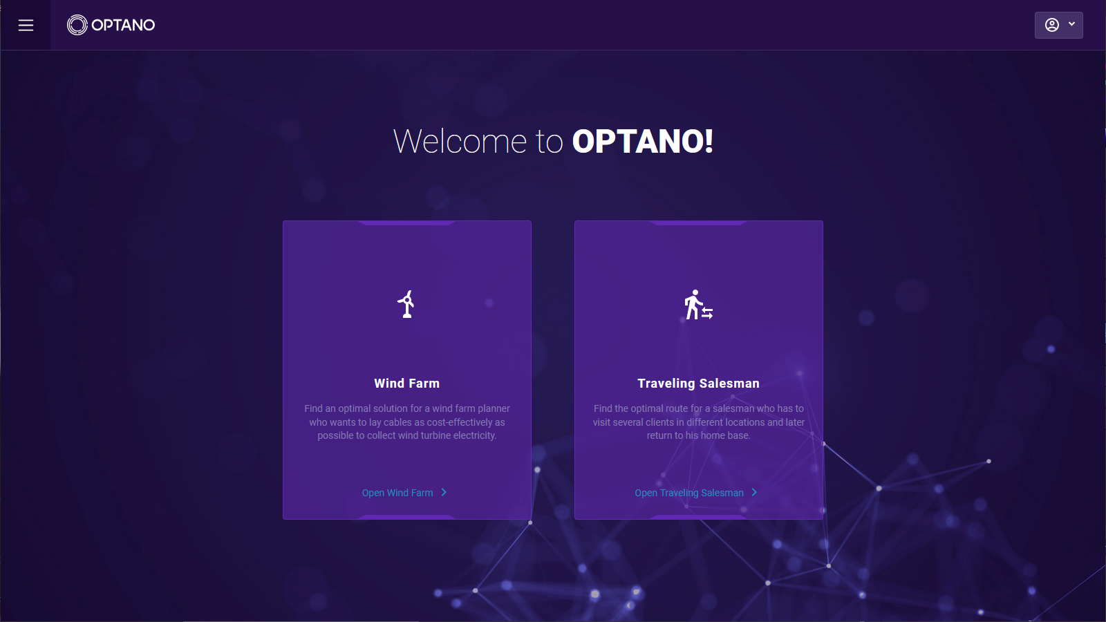
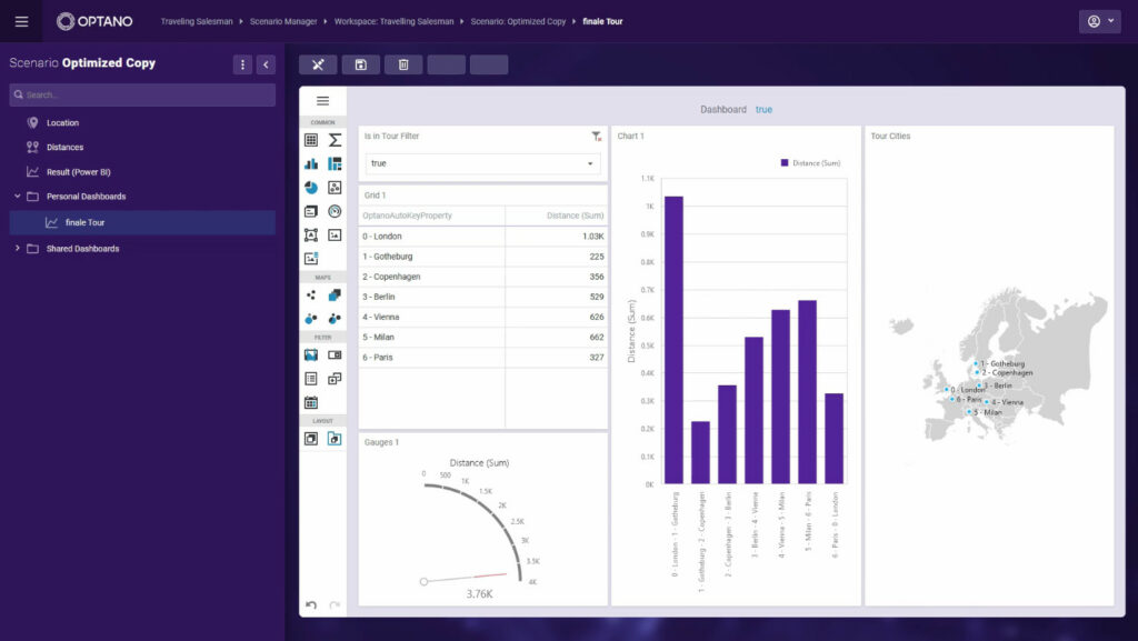
In 2021 we proudly released OPTANO 6.0 – and along with it our Web Client, to accompany the rich client. This means that OPTANO offers even more flexibility than ever as it can now be used from anywhere, it works on all browsers, no installation is necessary and users can share data such as scenarios quite easily with their colleagues, no matter where they may be. Not only that, the look and feel of OPTANO has been adapted. With the support of UI and UX experts Maximago, we have opted for a modern “dark theme” for the user interface. By integrating Microsoft Power BI and Tableau we have achieved highly effective data visualization which includes sophisticated graphs, charts and much more to help users analyze their data fast and efficiently. OPTANO also provides integrated dashboards which enables data visualization to be cusotmized to users’ individual needs.
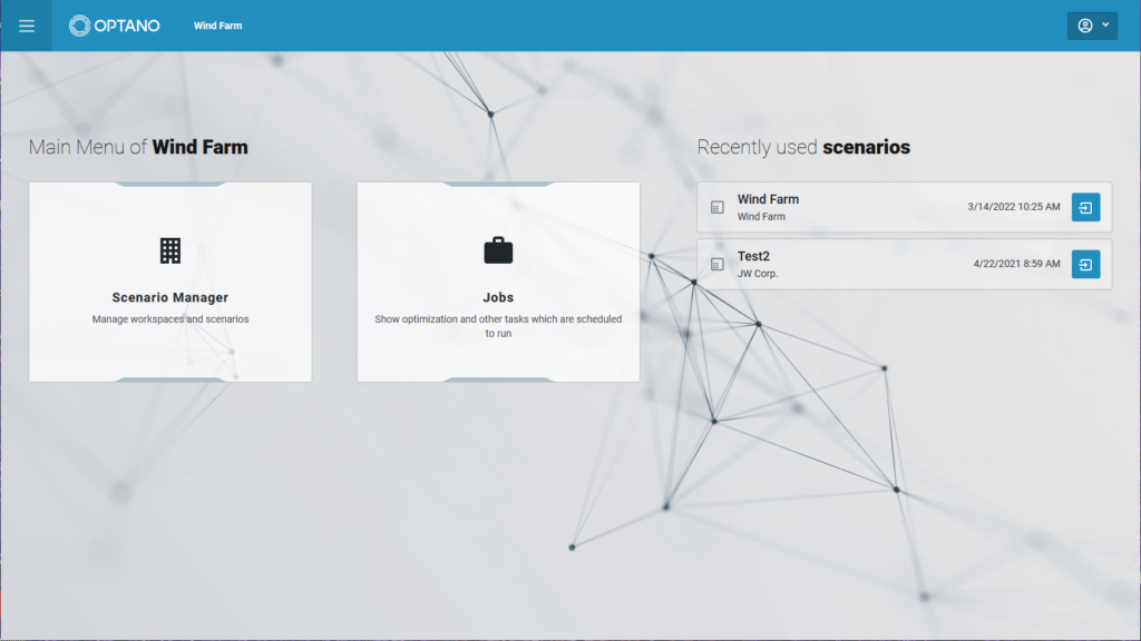
And while we are on the subject of individualization: The OPTANO Web Client can now be customized as you wish. The dark theme isn’t for you? You can opt for the light theme. Do you want it to be in alignment with your corporate design? No problem! You can choose the style and color that is appropriate. Individualization can significantly contribute to higher user acceptance. If users feel comfortable using a platform whose design and features are familiar to them, they are more willing to use it.
OPTANO - optimal planning results with the support of a user-friendly platform
OPTANO is an optimization platform which works with mathematical models and algorithms as well as with predictive and prescriptive analytics methods to ensure you get optimal planning results. And while this may sound complicated – you won’t even be aware of it while using the application. OPTANO is a user-friendly platform which functions as both a desktop and web application and is characterized by its transparency and intuitiveness. Whether it’s in production planning, supply chain management, network planning and many other areas, OPTANO makes your planning processes fast, efficient and flexible.
Navigating a way out of the maze
Sooner or later you always find the right way out of the maze. However, the fewer dead ends you come up against, the better. The same applies when using products, in our case planning software. The aim is to get to where you want to be – easily and within a short space of time. With OPTANO you can be sure that you will navigate your way to success without hitting a dead end.
Have you downloaded your factsheet yet?
Gartner divides analytics into 4 levels -we have described what they are and what they are used for in this whitepaper.
To obtain our factsheet, all you need to do is enter your contact details in the space below. A pop-up window will then open to download the whitepaper. Please note that by providing us with your email address, you agree that we may contact you on this topic. You may revoke this agreement at any time by contacting privacy@optano.com.

